It looks like the Adjusted Reserves has caught up to the increase in the Adjusted Monetary Base. The divergence was short lived.
Sunday, January 31, 2016
Thursday, January 28, 2016
Dollar Index/Barrel Head and Shoulders Pattern?
Will the ratio bounce at the middle of the Bollinger Bands (green circles) and return to the upper range (dark red circles) or break through (orange circles) and test the bottom of the range (yellow circles)?
Since I believe the Dollar has been as big a driver of low oil prices, one of the major factors pushing a big short covering rally seems to be in place.
Wednesday, January 27, 2016
S&P500 vs. Adjusted Monetary Base
The S&P500 and the Adjusted Monetary Base have been tightly correlated. Last week the AMB turned up. I would expect the S&P500 to do the same.
Adjusted Monetary Base vs. Adjusted Reserves
The Adjusted Monetary Base and Adjusted Reserves are diverging for the first time since the 2008-2009 Financial Crisis.
Oil Decline Extremes
Previous declines in oil prices have never been worse than 77%. Is this a bottom followed by a reversion or is this time different?
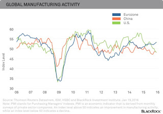
European Manufacturing
European Manufacturing is outperforming China and the US. With all the negativity this seems counter intuitive.
Thursday, January 21, 2016
Why I Expect More QE
The Yield Curve is flattening at the long end, while looking like it could start to invert on the short end.
The S&P500 has had a tight correlation to the monetary base. Will the Fed let the monetary base decline in an election year where Donald Trump is attacking the establishment?
Everyone is long the dollar. This could reverse quickly.
Dollar bull and bear markets last about 7 years on average. The USD bottomed in 2008. Any change in tone from the Fed could tip the tables quick and play right into the time period from bottom to top that the USD follows.
Why I think Oil is About to Rally
Oil has a history of bottoming in late January.
Oil tends to have strong returns in February and March.
Oil had a lot of volume around the $25-30 level when it broke out years ago, while a falling wedge pattern is developing on the charts.
Look at the volume on the recent decline. Is this capitulation?
Although the 5 year range is distorted, if inventories stay flat, they will drift into the distortion and that changes the narrative.
Traders have been piling into $30 and $25 US put options on the oil futures contract.
Strong support with a bullish technical pattern, maximum pessimism and seasonal strength all add up to a good chance of a strong bounce.
Interesting Chart 4 - January 21, 2016
Hourly wages should help stimulate the US economy and start pushing headline inflation higher. This should give the FED some good news.
Interesting Chart 3 - January 21, 2016
On the very, very short end of the Yield Curve, it is getting close to inverting, while the long end is flattening.
Interesting Chart 2 - January 21, 2016
Light truck sales are a forward looking indicator with respect to strength in the US economy. It is not a good sign to see them rolling over. For now it is not a concern, but should the trend line break...
Interesting Chart 1 - January 21, 2016
The world is obsessed with the term growth. Net expansion in China is still as large as it was when it had a higher growth rate (ie it was growing off a lower base).
Wednesday, January 13, 2016
What if?
Saudi Arabia has suggested that they will IPO a portion of Saudi Aramco . Some have suggested Aramco is the world's largest and most valuable company. So what if one of the goals of the oil price war was to sell the IPO shares to wealthy Sunni's at a discount valuation and then cut oil production, under the guise of "new business management" and triple the share price making billions for the investors?
Monday, January 11, 2016
Interesting Chart 4 - January 11, 2015
You can own 4 technology stocks or every single energy firm in the S&P500. All those reserves or all the data.
Friday, January 8, 2016
Interesting Chart 3 - January 8, 2016
When the public hoards cash that cash is lost to the banking system and that is deflationary as the velocity declines. Has the public lost its interest in hoarding cash?
Interesting Chart 2 - January 8, 2016
With all the fear in the world, its important to look at a number of indicators. The USGS publishes the nonmetallic mineral product indicators (stone, clay, cement and glass), leading and coincident, and both are trending higher.
Interesting Chart 1 - January 8, 2016
Tech is approaching the large weighting it had during the TMT bubble of the late 1990s, while Energy is approaching the small weighting it had at the bottom in 1998. What would a contrarian investor do?
Wednesday, January 6, 2016
If this chart is right, China is bottoming and the US is about to enter late stage expansion. That may suggest the market is worrying about what is in the rear view mirror.
Monday, January 4, 2016
What happened in 2005 to cause these two data sets to become inversely related? From 2000-2005 they were correlated, but that has changed? What would the implications be if they became correlated again?
Interesting Chart #2 - January 4, 2015
What if this is not seasonal or weather related? Could this mean a pause in FED rate hike plans?
Interesting Chart #1 - January 4, 2016
Subscribe to:
Posts (Atom)


